Line Charts in Stocks
A line chart is the simplest type of chart that exists in stock trading. It provides the least amount of stock data, but at the same time, it is the easiest way to interpret the historical performance of an asset and analyze its current and past performance.
In this lesson, we are going to talk about stock charts. Namely, we’re going to talk about line charts. Now, don’t be thrown off by me talking about sophisticated charts. In fact, some of the most successful traders believe that the best methods are the simpler ones.
Why? Because simple methods are easier to understand and, therefore, easier to use. Many stock traders believe that line charts are exactly that – simple and easy to use. So let’s see how to read and use line charts.
What are Line Charts?
Line charts are believed to be the simplest, most basic type of chart used for stock trading. In essence, line charts draw a single, continuous line from one closing price to the next one over a long period of many closing prices (or opening prices).
This then forms a coherent line in which information about a certain stock can be gathered. For those unaware, the closing price refers to the last price a stock traded for the specified period.
This type of chart provides traders and investors with a clean & easy way to understand the view of the stock prices as they filter out all the market noise. Now, we can only say as much without showing you what line charts actually look like. And you know what they say, a picture speaks a thousand words, so let’s take a look!
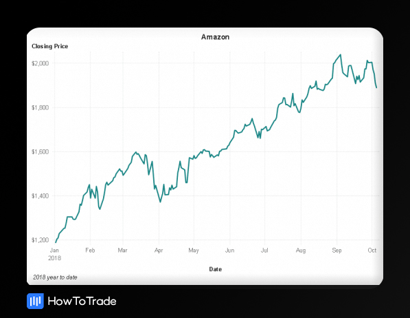
As you can see, the Amazon line chart shows the stock price trend line over a predetermined time frame. No complications – it simply shows only a single line of the past performance of an asset and provides a clear visualization of how the stock performed over the chosen period.
For that reason, many fundamental analysts believe they should analyze assets using line charts. They are not looking for sophisticated charts as they think that nearly every stock chart shows the same information to get the historical data and find the trading range of the specific stock.
Moreover, many experienced traders can identify trends and chart formations like the head and shoulders pattern, descending triangle patterns, and other popular chart patterns on a straight line chart.
Technically, on a line chart, the X-axis (Horizontal Axis) is the independent variable and represents the time period. The Y-axis (Vertical Axis) is the dependent variable and shows the price of security you are tracking.
Seems pretty simple to follow, right?
Well, that’s because it is! However, the downside of a line chart is that even though it shows a clear overview of what has been happening in the stock market, they don’t necessarily provide traders with much information or detail about historical price action within a certain period.
In the example above, we can see how Amazon’s stock price rises over time, but we cannot analyze crucial data like specific price points and price levels, the opening price, and areas of a high trading volume.
Instead, all they show is a series of data points and their closing price at the end of each period. Everything else is a big question mark. That’s why this type of chart is usually used to get the bigger picture view of price movements.
For example, unlike a candlestick chart or even a bar chart, it is difficult to identify a trend reversal or find basic volume patterns on a line chart. Further, adding common technical indicators like the simple moving average is not very helpful when using a line chart.
Fun Fact: Charles Dow, the developer of Line Charts, was only interested in the closing price of the instrument, as she believed the close determines each trading day’s unrealised profit or loss.
Advantages & Disadvantages of Using Stock Chart Lines
Advantages
- Line charts filter out all of the market noise.
- Their simplicity makes the market appealing and easy to follow.
- The simplicity of the line chart also helps traders determine the support and resistance level, turning points, and various chart patterns.
Disadvantages
- Line charts filter out too much market noise and do not provide enough price information.
- Line charts miss out on crucial data that would otherwise impact trading decisions.
- Line charts can generate a lot of false signals if used incorrectly.
Wrapping Up
Even though line charts may be too ‘simple’ for some, they still provide us with the necessary information. Above other things, they can be super valuable to analyze the stock’s price movement, spot low prices, high prices, stock market trends, draw trend lines, and find key support and resistance levels (or support & resistance points).
Most importantly, because many news sites use line charts as their default type of charts, you must know how to read stock charts in the form of a line chart.
That said, this should be your only use of line charts, especially as a beginner. When you analyze a stock’s price performance, it would be much more efficient to use candlestick charts or figure charts as they provide more information and can help you find repetitive chart patterns.
In the next couple of lessons, we will cover some more advanced techniques and charts. We will take a closer look at the two most popular chart types used for technical analysis – Candlestick Charts and Bar Charts.


Up To $5,000 Credit!
- Trade 1,000’s of global markets.
- 0% deposit and withdrawal fees.
- Rapid funding turn-around times.
- Trade on MetaTrader 4 and 5.