Candlestick Charts in Forex [Explained]
Now that you’ve mastered the line and bar charts, it’s time we covered another super popular forex chart – the Japanese Candlestick Chart. Candlestick charting is the most popular and commonly used method of analyzing price movement on a chart.
Here
What is a Candlestick Chart?
A candlestick chart (also called the Japanese Candlestick Chart) is a type of price chart used in technical analysis that displays the high, low, open, and closing prices for a specific time period. It was designed by a rice merchant in Japan, Munehisa Homma.
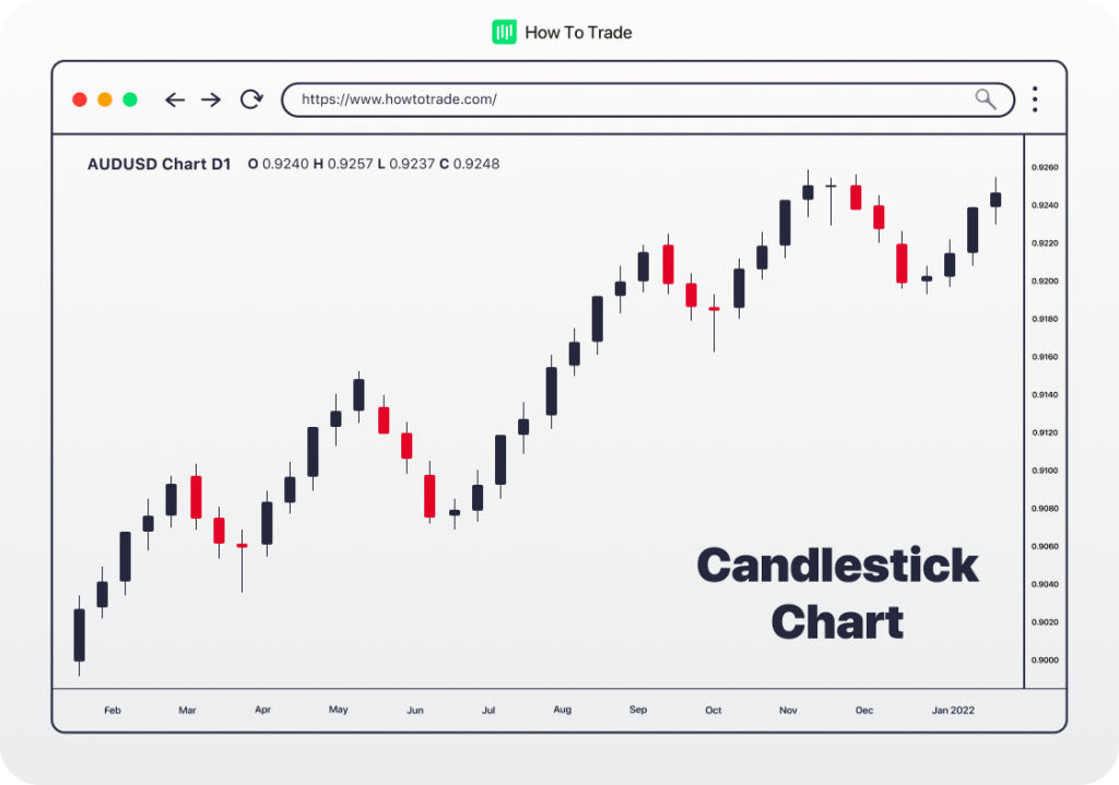
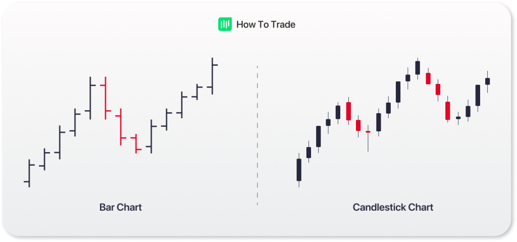
Candlestick charts are very similar to bar charts. Like the bar chart, each candlestick you see represents a specific period. So, if you’re on a 5-minute timeframe, every candlestick on that chart will denote how the price has moved within every five minutes.
There are some differences, however, that make candlesticks the preferred choice by many traders. For one, the colors on candlesticks make it easier to visualize price action. The colors on candlesticks also make it easier to identify trading patterns.
What are the Components of the Japanese Candlestick?
A candlestick comprises two main parts; the shadows or wicks, and the body.
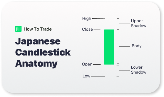
1. The Body
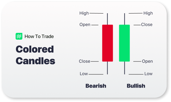
Candlestick bodies represent the price range between the opening and closing prices within a time interval. Typically, a black or red body means the price closed higher than it opened. In other words, the price opened at a low price, moved higher within the time period, and closed at a higher price. This candlestick is called a bullish candlestick.
Conversely, a white or green body means the price closed at a lower price than it opened. This candlestick is called a bearish candlestick. The colors are not set in stone, though; they’ll depend on your charting platform.
2. The Shadow
The candlestick shadows (also known as wicks or tails) are depicted as thin lines on the top and bottom of the body of a candlestick. These upper and lower shadows provide important clues about the trading session. An Upper shadow signifies the session’s highest price, while a lower shadow signifies the session’s lowest.
And since everything is better in colour, traders can alter their candlestick colours in their trading platform too. A colour telly is much better than a black and white telly, so why not splash some colour on those candlestick charts too, right? Traders can simply substitute green instead of white, and use a green candle instead of black and a red candle instead of white.
This means that if the closing price was higher than the opening price, the candlestick would be a green candle. Otherwise, if the price closed lower than it opened, the candlestick would be red.
How to Read a Candlestick Chart
Not only can the bodies have different colors, but candlesticks also have different body sizes. Long bodies indicate strong selling or buying pressure. The longer the body is, the more intense the buying or selling pressure. This means that either buyers or sellers were stronger in that period. Short bodies imply very little buying or selling activity and usually indicate indecision.
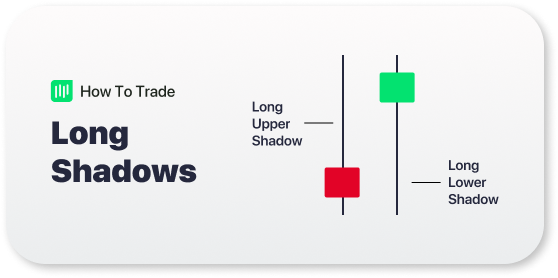
Just like the bodies, the size of the shadows also tells a story about the price movement within that period. If a Japanese candlestick has a long upper shadow (upper wick) and short lower shadow, this means that buyers flexed their muscles and bid prices higher. However, sellers came in and drove prices back down to end the session back near its open price, which ultimately indicates a bearish reversal pattern.
On the other hand, if a Japanese candlestick has a long lower shadow and short upper shadow, this means that sellers flashed their washboard abs and forced the price lower. However, buyers came in and drove prices back up to end the session back near its open price, which signals strong buying pressure and the beginning of a bullish trend.
Pros and Cons of Candlestick Charts
Here are the potential advantages and disadvantages you might have to put up with when using candlestick charts for trading.
Advantages of a candlestick chart
- A candlestick chart is considered the most convenient and popular among forex traders
- Most analysts in the forex market use candlestick charts to present forex chart analysis Highly informative price chart
- Visually easy to read and use in forex trading
- Displays the full information of each time frame – meaning opening price, closing price, high price, and low price
- Offers a deeper insight into price action and helps traders to predict future prices
- Flexible and can be used alone or in combination with other technical analysis tools
- Unlike other forex chart types, candlestick charts are available on any forex trading platform
Disadvantages of a candlestick chart
- Doesn’t show the exact price movements of a currency pair or the traded financial instrument
- Doesn’t present the bigger picture
- Fewer candlestick charts on the screen in comparison with bar charts, which means that you have less information to do forex charts analysis
- Comes with a gap
- Does not tell you which came first, the high or the low
- Doesn’t display the long-term trend and price momentum
- Looks different in every time frame and on various trading platforms
Best For: Scalpers, day traders, and swing traders
Key Takeaways
- Candlesticks are charting tools that help traders visualize the open, high, low, and close prices within a specific time period.
- Candlesticks have two components: the body and the shadows (or wicks)
- A bullish candlestick is one whose closing price is higher than the opening price. It’s green or white on most charting platforms.
- A bearish candlestick has a lower closing price than the opening price. And it’s red or black on most charting platforms.


Trade 1 Lot for just $2.5 commission*
- Trade 1,000’s of global markets.
- 0% deposit and withdrawal fees.
- Rapid funding turn-around times.
- Trade on MetaTrader 4 and 5.