How to Read a Bar Chart for Stock Trading
Bar charts are one of the most popular chart types to analyze financial assets. Like other chart types, they provide a lot of information traders and investors can use when analyzing the market.
The good thing is that it is pretty easy to read and interpret bar charts. And even if you’ll end up using candlestick charts to analyze the markets, you must know how to read bar stock charts as many news sites often use this chart type.
So without further ado, let’s explore this fantastic chart type!
What are Bar Charts in the Stock Market?
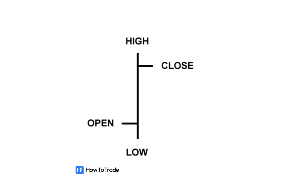
A bar chart is a collection of price bars, each showing the given stock’s real-time price movements. Each bar has a vertical line that shows the highest price the stock reached during the stock period and the lowest price the stock reached during the pre-set time period.
The open stock price is typically marked by a small horizontal line on the left of the vertical line, and the close price is marked by a small horizontal line on the right of the vertical bars.
This is what a bar looks like in black & white.

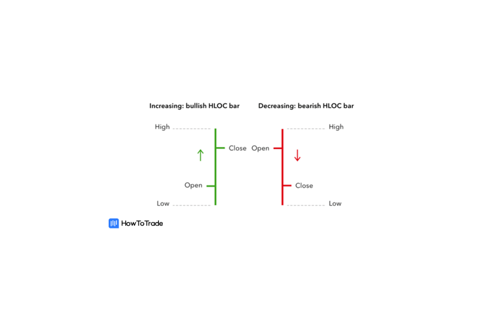
Now, you most likely won’t use the black & white version of bar charts in your trading platform. In fact, most traders prefer the color-coded version and use the green & red bars for their trading purposes. The color-coding helps them to see prices, their movements, chart patterns, and trends more clearly.
The bars are colored green if the closing price is above the open price, which means the price increased in value during that period.
The bars are colored red if the closing price is below the open price, which means the price dropped during that period.

How Can You Read a Bar Chart?
Ok, so bar charts are often also called OHLC Charts. Why? That’s because bar charts consist of the open, high, low, and close prices for that particular stock. So, let’s see what it actually means.
Open
The open marks the price the stock trades at the start of the trading day and is indicated by the horizontal foot on the left side of the bar. The opening price is generally the same as the previous closing price.
High
The high marks the stock’s highest price traded during the day and is indicated by the top of the vertical bar.
Low
The low is the lowest price the stock traded during the chosen period and is indicated by the bottom of the vertical bar.
Close
The closing price is the last price the stock traded for during the day and is indicated by the horizontal foot on the right side of the bar. The close price is the most critical data point on the bar because it summarizes the final sentiment of the preset period.
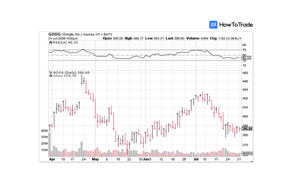
We know. That’s a lot of information but now that you know what everything means, let’s look at what an actual stock bar chart looks like in real-time.

Looks pretty good, right? Look at those trends! As you can see, it’s straightforward to read a bar chart and even see some chart patterns to predict the future price movement of an asset (although most chart patterns work best on a candlestick chart).
Now, like a candlestick and line chart – the good thing about bar charts is that they show the stock’s trading range for whatever period you choose. You can choose from the following:
- 1-minute bars (show a new price bar each minute)
- 5-minute bars (show a new price bar every five minutes)
- 15-minute bars (show a new price bar every fifteen minutes)
- 1-hour bars (show a new price bar for every hour)
- 4-hour bars (show a new price bar for every four hours)
- Daily bars (show a new price bar for every day)
- Monthly bars (show a new price bar for every month)
Bar Size Matters
Yup, that’s right. Bar size matters. Teeny tiny bars with a minor difference between highest and lowest prices symbolize a lack of interest by both buyers and sellers, meaning they usually indicate indecision and a trend reversal possibility. On the other hand, big boys, tall bars with a vast distance between high and low prices symbolize a lot of buying or selling interest from traders and usually signal that the existing trend is likely to continue.
The Bottom Line
Of course, there is so much more to bar sizes than this, but for now, that’s all you need to know. Quality over quantity, am I right?
And while stock bar charts are not absolutely spot-on accurate in their ability to predict stock price movements and come with price gaps at times, they provide technical analysts with a good tool to spot technical analysis chart patterns, trends and understand the overall financial markets price action better.
In the next lessons, we’ll explore other types of charts and help you find what type of stock chart is the best for you to use. Let’s move on then!

